Every space is inhabited by people with unique realities, perceptions, and expectations. That’s why in interior design, guiding color choices should not only consider the intended function of a space, but also the individuals who will experience it.
As Arielle Eckstut, author of What is Color, states: “There is no color without eyes and the brain.” In other words, the same shade can evoke entirely different perceptions depending on who is observing it.
In this context, explore how thoughtful color selection can create environments that truly resonate with the needs and sensitivities of end users.
Choosing colors for a space goes far beyond style or trend. To create environments that are truly responsive, designers must consider how users perceive the colors around them.
This perception is shaped by several interconnected factors, including age, culture, and the intended emotional effect. What feels calming, energizing, or reassuring can vary greatly depending on someone’s stage of life. Similarly, the same color may carry completely different associations from one culture to another. Furthermore, whether the goal is to encourage relaxation, focus, or stimulation, color choices should align with the emotional needs of those who will use the space.
By taking these dimensions into account, color becomes a powerful tool for adaptation and well-being, reflecting the expectations of its users.
Color perception and preferences change significantly with age, shaping how environments are experienced and felt.
Color perception varies greatly across cultures, making it a crucial factor to consider in design. A color with a specific meaning in one region may carry a completely different connotation elsewhere.
For example, white is commonly associated with purity and peace in Europe and North America, but in many Asian countries, it symbolizes mourning. Black, often linked to death in Western cultures, doesn’t necessarily carry the same weight worldwide. Red, typically seen as a color of danger or passion in Western societies, is associated with good fortune and celebration in China and many parts of Asia.
This diversity of meanings highlights the importance of researching to ensure that color choices are both strategic and respectful, in line with the intended message and the cultural context of the target audience.
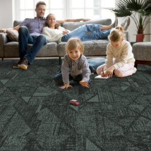
Colors have a direct impact on emotions and behavior, making their selection essential to shaping an atmosphere that aligns with users’ expectations. Do they seek a space for relaxation and renewal, or are they looking for an environment that inspires and energizes? To achieve the desired effect, it is important to ask the right questions and rely on principles of color psychology to select hues that support the intended experience.
For example, in a spa designed to promote calm and a connection to nature, combining soft blues with green tones can foster a deeply soothing environment. On the other hand, to design a space that feels warm and energizing, orange is an excellent choice thanks to its positive and welcoming energy.
To explore these concepts further, see the article: The Role of Color Psychology in Interior Design.
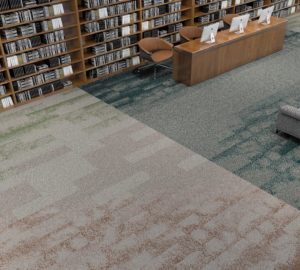
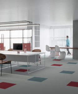
Many additional factors must be considered when designing environments that are truly user-centered. An inclusive and holistic approach that integrates these various parameters can significantly enhance the overall experience.
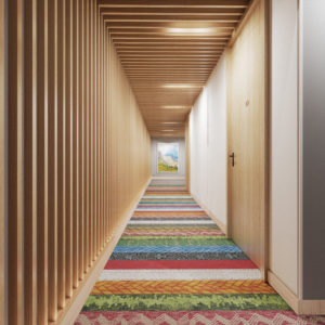
This is precisely where modular carpets find their full meaning: they provide unique flexibility to adapt colors, patterns, and moods according to the real needs of occupants.
Explore our modular carpet collections: flexible and elegant solutions tailored to diverse users and evolving environments.