Color plays a fundamental role in how we perceive spaces. More than just an aesthetic choice, it influences our emotions, behaviors, and overall well-being.
From the calming effect of blue in an office to the energy of orange in a reception area, color psychology becomes a powerful strategic tool in interior design.
But how can we select the right colors to create environments that meet users’ needs while remaining both functional and harmonious? That’s exactly what we’ll explore in this article.
Color perception is shaped by various factors, including lighting, material texture, and human psychology. Red, for instance, is used for traffic lights and warning signs because it immediately draws attention and is instinctively linked to danger or urgency. This is where color psychology steps in, examining how different shades can influence human perception, emotions, and behavior.

Each color holds a unique power, evoking specific responses and producing distinct effects on our nervous system and emotional state. While some colors energize, others calm or stimulate the mind.
Let’s go back to red, mentioned earlier. This bold hue has a direct physiological impact, such as increasing heart rate. As a result, it generates feelings of excitement and confidence while infusing a surge of energy.
Pink, though derived from red, has a gentler effect. It tends to inspire feelings of comfort, tenderness, and warmth. Similarly, blue promotes calm and concentration, contributing to a sense of mental clarity and balance.
Yellow is often associated with joy and optimism, sparking creative thought and intellectual engagement. Orange brings a sense of warmth and sociability, making environments feel more welcoming. Green, with its deep ties to nature, supports mental regeneration and emotional balance, while also subtly influencing our perception of time.
Thus, each color goes far beyond decorative purposes, serving a distinct function in how we perceive space and experience emotion.
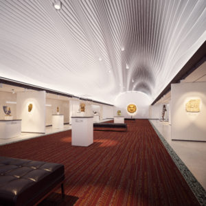
Collection: Four Sacred Medicines
When designing a space, the choice of colors is largely determined by the function of the environment, as well as the atmosphere one wishes to convey. Each setting comes with its own specific requirements.
These examples illustrate just a few ways in which color can be applied strategically based on context. However, the possibilities go far beyond this. Factors such as lighting, materials, and spatial layout also influence how colors are perceived and experienced. A thoughtful, tailored approach can fully harness the power of color to create unique and effective environments.
Moreover, colors can be chosen not only for their psychological impact but also for their relevance to current design trends. Take a look at our 2025 Color Trends article to discover the standout shades of the year.
Each color tells a story, evokes a feeling, and creates a connection between users and their environment. Understanding the psychology of color and its effects allows for informed, strategic choices in interior design. This philosophy guides our approach: offering flexible solutions that adapt to the specific needs of each space. Far more than just a flooring option, our modular carpets act as a true canvas for expression, where color and texture come together to shape distinctive atmospheres.
Want to learn more about the power of color? Contact our team for a complete presentation, accredited and recognized by APDIQ and ARIDO.